
Why "Ugly" Works: The Power Of Raw Authenticity In Modern Branding
Hiding in plain sight: How more and more brands are turning to simplicity and forced errors to help their messaging stand out, especially in the AI era.
Did you just notice an ad with an error in the text or a flaw in the design? Before you snigger, hold your contempt. That error wasn’t an oversight by a careless design or content team. It was likely a deliberate, forced error inserted by the brand to grab attention. You noticed it, right? Mission accomplished. In a world where everything is supposed to be perfect, it forces you to pause. Why? Because in modern marketing increasingly catering to Gen Z, a perfectly placed “authentic” flaw is fast becoming a calculated tactic for grabbing eyeballs.
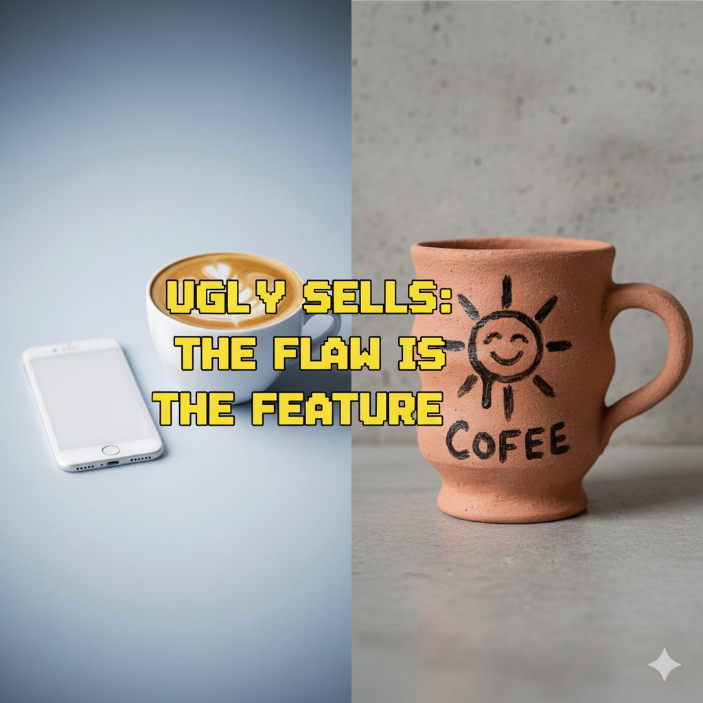
Think of it as the difference between a natural and an artificial pearl. The first is often irregular or asymmetrical; perfectly round shapes are very rare, while the artificial one is perfectly round and identical in shape across a strand. And flawless. But it’s the natural pearl with all its flaws that is more prized!
We live in an era full of highly polished aesthetics, AI-generated perfection, and the relentless pursuit of curated digital flawless. But there’s now a counter-movement in branding brewing. While the broader concept of “anti-branding” – a deliberate rejection of traditional, overt marketing – has roots tracing back to critiques of consumerism in the late 20th century, its modern manifestation is more nuanced and, arguably, more impactful.
Today, for example, we’re witnessing the increasing popularity of “Loud Non- Design,” a specific facet of anti-branding that strategically embraces intentional “ugliness,” rawness, and imperfection to forge deeper connections with a skeptical audience.
For decades, brands invested heavily in slick photography, bespoke typography, and sophisticated graphic design to convey quality, trustworthiness, and desirability. However, as consumers, particularly younger generations like Gen Z, grew increasingly weary of being “sold to” and developed a keen eye for inauthenticity, this traditional approach began to lose its potency. Social media, initially a platform for aspirational lifestyles, has ironically amplified this consumer fatigue, as users crave “realness” over filters.
Part of the Overall Anti-branding Strategy
Yes, loud non-design is a tactic often used within the larger anti-branding movement. The aesthetic of anti-design serves the purpose of an anti-brand by intentionally using jarring, chaotic, and “ugly” visuals to challenge consumer expectations and stand out from a saturated market of polished brands.
How loud anti-design serves the anti-branding movement
Rebellion against perfection: Anti-design rejects the curated, symmetrical, and minimalist aesthetics that define many corporate brands. For consumers tired of seeing “perfectly aligned flat lays” and “hyper-curated copy,” this unrefined, chaotic look feels more real.
Standing out from the crowd: In a digital world where design can look homogeneous, an intentionally loud and messy style can be a powerful way for a brand to get noticed. The “in-your-face” visual assault grabs attention and forces consumers to take a second look.
Showing authenticity: By eschewing traditional, slick design, a brand can communicate a sense of genuineness and transparency, which is highly valued by younger generations, particularly Gen Z. The raw, lo-fi aesthetic tells consumers that the brand is more focused on its purpose and product than on expensive, artificial marketing.
Provoking emotion: The point of anti-design isn’t just to be ugly for its own sake. The visual chaos is meant to create an impact and provoke a reaction from the viewer, whether through humor, irony, or a sense of rebellion. This emotional engagement helps to build a stronger, more authentic connection than a sterile, corporate design.
The Humanizing Flaw: Embracing Imperfection in a Perfected World

As you may have realized by now, the core of loud non-design lies in its intentional embrace of the “humanizing flaw.” This isn’t accidental sloppiness; it’s a calculated move to inject vulnerability and honesty into a brand’s visual identity. Think of visuals that look like they were quickly sketched in MS Paint, grainy smartphone photos instead of professional studio shots, or even deliberately placed “typos” in digital assets. These elements, once considered cardinal sins in branding, now serve as powerful signals of authenticity.
Consider the early marketing of Oatly, the Swedish oat milk brand, which exemplifies this perfectly. Their packaging and social media presence often feature quirky, almost crude, hand-drawn illustrations, conversational and sometimes rambling text, and a self-aware, often humorous, tone that pokes fun at advertising itself. There’s an intentional lack of gloss that makes them incredibly relatable. They don’t try to be cool in a traditional sense; they’re cool because they’re genuine and don’t take themselves too seriously. This deliberate rejection of polished perfection makes them feel accessible and trustworthy, appealing to consumers who are tired of generic health and wellness aesthetics.
Another example can be found in the rise of user-generated content (UGC) campaigns that prioritize raw, unedited footage over highly produced commercials. Brands are actively encouraging customers to share their unvarnished experiences, understanding that a shaky, authentic video from a real person resonates far more deeply than a perfectly staged advertisement. This strategy leverages the inherent trust consumers place in peer recommendations over corporate messaging, making the “flaw” of amateur production a strength.
There have been no global surveys that specifically quantify “Loud Non-Design” or “Anti-Branding of Authenticity” adoption across all brands of late (or even before 2024-25).
However, based on market trends, design reports, and consumer behavior statistics, one can safely offer a qualitative assessment of its prevalence and growing influence.
After studying global markets, on a scale of 1 (Non-existent) to 10 (Dominant Tactic), I would like to think the loud non-design angle would likely fall in the range of 7-8 for emerging, digitally-native, and Gen Z-focused brands, but probably closer to 4-5 across the entire global brand spectrum (including legacy corporations). Of course, these are educated guesses, and purely from my subjective viewpoint.
The Power of Plain: Using Default Fonts and Colors to Build Trust
In a visual landscape dominated by custom fonts and intricate designs, there’s a growing power in the “anti-aesthetic of the default.” This involves brands intentionally opting for basic, widely available elements: standard system fonts like Arial or Times New Roman, simple black-on-white colour schemes, or packaging that resembles plain, functional industrial design. This isn’t laziness; it’s a strategic move to cut through visual noise and signal a focus on substance over superficiality.
The appeal here is twofold: it telegraphs transparency and straightforwardness. When a brand doesn’t spend lavishly on elaborate design, it implicitly communicates that its value lies elsewhere — in the product’s quality, its efficacy, or its ethical production. This minimalist approach can also lend an air of confidence, as if the product is so good it doesn’t need flashy packaging to sell itself. It also subverts expectations; in a sea of bespoke, a simple, almost generic visual identity becomes incredibly distinctive.
This approach often taps into a pragmatic, utilitarian mindset. Imagine a direct-to-consumer brand for household cleaning products that uses stark, chemical-lab-like labels with bold, sans-serif fonts and clear instructions, rather than vibrant colours and lifestyle imagery. It speaks to consumers who prioritize function and clarity, positioning the brand as honest and no-nonsense. This “default” aesthetic subtly suggests, “We’re not hiding anything behind fancy frills; here’s exactly what you need to know.”
Tone of Voice as the New Logo: Crafting Identity Beyond Visuals
Perhaps one of the most compelling aspects of loud non-design is the elevation of tone of voice to a primary branding element, often supplanting or complementing minimal visual cues. When visuals are intentionally understated or “ugly,” the brand’s personality must shine through its language, creating a distinct identity that resonates deeply with its audience. This “voice” acts as the new, intangible logo, instantly recognizable and highly memorable.
Liquid Death, the canned water brand, offers a masterclass in this strategy. Visually, their branding evokes heavy metal aesthetics; think ominous skulls, gothic lettering, and a dark colour palette more typical of beer or energy drinks than water. But it’s their audacious, irreverent, and often darkly humorous tone of voice that truly sets them apart. Their slogans like “Murder Your Thirst” or “Don’t Be Scared. It’s Just Water.” combined with their “manifesto” that mocks corporate jargon, create an unforgettable brand experience. They leverage shock value and self-aware irony to appeal to an audience that rejects traditional, “healthy” water branding. Their visual anti-aesthetic is amplified by a powerful, distinct voice that builds a cult following.
Similarly, Duolingo’s social media presence, particularly on platforms like TikTok, demonstrates how a brand can cultivate a unique identity through voice. While their app maintains a clean, functional design, their online persona is playfully unhinged, self-deprecating, and occasionally aggressive (the owl mascot, Duo, famously “holds users hostage” to learn languages). This quirky, meme-driven engagement is a stark contrast to typical educational brands, making them incredibly popular and relatable to a younger, digitally native audience. Their “voice” is so strong that it becomes a defining characteristic, effectively acting as a highly engaging “logo” in the social sphere.
Anti-branding is a broad movement that intentionally subverts traditional marketing, image building, and corporate consumerism. Historically, its most prominent form arose in the late 1990s as a form of social activism, gaining mainstream recognition with the publication of Naomi Klein’s seminal 1999 book, “No Logo”, which critiqued the increasing corporate control over public and cultural life and the pervasiveness of global “megabrands.”
In the modern commercial landscape of the 2020s, anti-branding has been strategically co-opted by many digital-native companies as an internal marketing strategy to connect with skeptical consumers. This modern approach — which includes tactics like loud non-design — is a direct response to the saturation of polished, inauthentic corporate messaging and the rise of AI-generated content. Instead of rejecting branding entirely, these companies deliberately utilize raw, lo-fi visuals, irreverent tone of voice, and transparent communication to signal authenticity, humility, and a rejection of the curated “influencer aesthetic,” effectively making the anti-brand attitude their core brand identity.
The Strategic Imperative for Modern Marketers
For digital marketers, content providers, and brands, understanding loud non-design isn’t about simply making things look “bad.” It’s about a strategic decision to embrace vulnerability, cultivate authenticity, and communicate with radical honesty. It acknowledges that in a world awash with curated perfection, imperfection has become the ultimate differentiator.
This approach requires a profound understanding of your audience and the courage to break from traditional aesthetic norms. It demands that brands invest not just in visual design, but equally in developing a unique, human, and resonant tone of voice. As consumers continue to seek genuine connections and recoil from overt commercialism, the brands that master the art of loud non-design will be those that truly stand out, build trust, and ultimately, thrive in the evolving digital landscape.
Reference:

https://www.marketingmonk.so/p/liquid-death-rejected-traditional-marketing-and-built-a-cult-following
https://www.lippincott.com/ideas/go-to-brand-spotlight-duolingo
https://vibely.fi/the-rise-of-anti-branding-in-influencer-marketing/
https://delusional.company/anti-branding-when-brands-rebel-against-the-status-quo